Paperie Sheep

fresh & modern hand crafted stationery

Tai

Henry1 Comment
have you seen a layering invitation? it's almost like a deconstructed invitation! it was a lot of fun to make them!


Karen asked me to create something unique, modern and romantic, in a layered design.


the venue she has is gorgeous, it has these two beautiful chandeliers, so i thought why not have a chandelier design as the focal point?


to bring the romance into the picture, i chose peach color in different shades, it match the venue perfectly!

this was only a sample for the bride, i will show you the real invitation soon!

Jennifer

HenryComment
Jennifer wanted a wedding with everything in squares, including her ring (sort of), cake, centerpieces, votives candles, and of course, invitations. she wanted something simple, modern and elegant, and most importantly, timeless.


groom's little sister designed the monogram for them, she was only 14! how sweet is that? a little tab was created to incorporate the monogram as part of the invitation, rather than an addition to it.

to keep the square theme thru out the invitation, a skinny brown ribbon with black square pattern was added to bring out the color of the paper. 

instead of having her announcement glued to the evenlope itself, a half moon shaped cut was made on both top and bottom to secure the card in place.

rsvp was in a lighter mango color that complimented the warm orange of the invitation.

Kat

Henry1 Comment
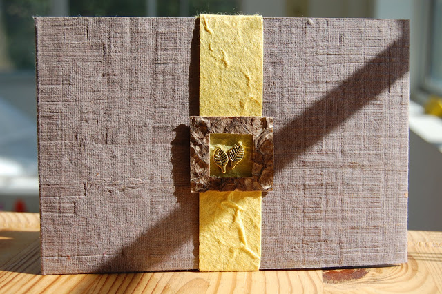
what could be a better invitation for a wedding at a ranch? tree like textured paper! i created this invitation for Kat when she told me she wanted something very rustic and different. i made her invitation with all handmade papers, i like the irregularity of handmade products, the imperfections of them made them perfect in my eyes.


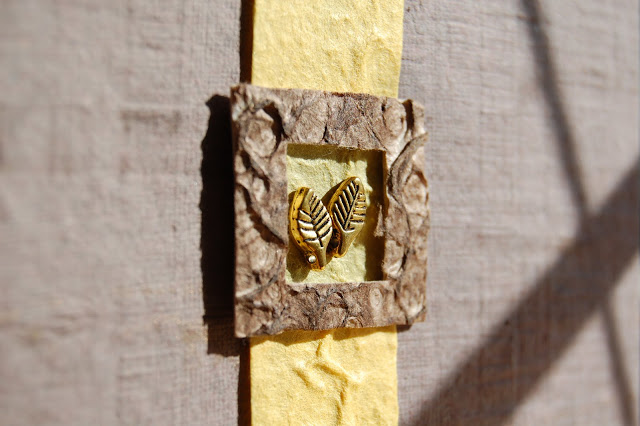
 Kat also asked to have leaves as part of her invitation, so i put them right in the spot light, framed with beautiful textured paper.


even raised the frame a little to bring out the texture.


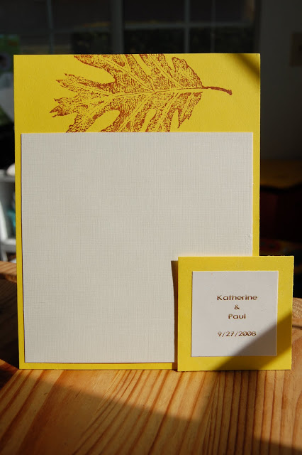
her table menu was simple and to the point in a bright happy sunshine yellow, just like Kat's personality. next to the menu was the tag on her favor - hot chocolate in a jar, sweet!


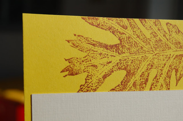
love all the intricate details of the leaf!

double J sneak peek

HenryComment

This is a sample of Joey's invitation to her Spring wedding in the wine country, actual invitation is yet to come! I dont like to post pictures of the invitation until the bride has sent out all her invitations and after most of her guests have received them.


love love love the purple!

short and sweet

Henry2 Comments
yuko asked me to design her wedding invitation with a pair of love bird, she left the rest of the designing decisions to me and only asked for her love birds to be "short and fat".


i designed a boy bird kissing a girl bird on stems of some whimsical flowers


the invitation was letterpressed on a 4.5" x 6.25" 100% cotton cardstock


aren't these birds chubby?


to further the bird theme but to mix it up a bit, i placed the boy and the girl on the opposite side of the rsvp card, it came out adorable.


thank you cards had the same kissing love bird design


always end with my fav line

yellow sunshine girl

Henry4 Comments
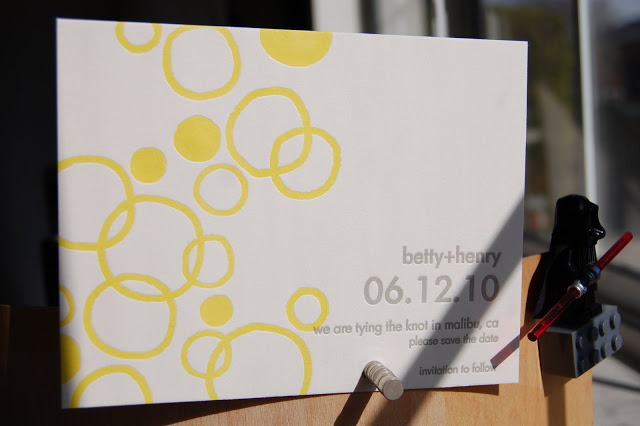
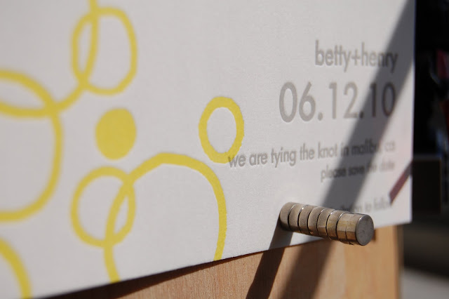
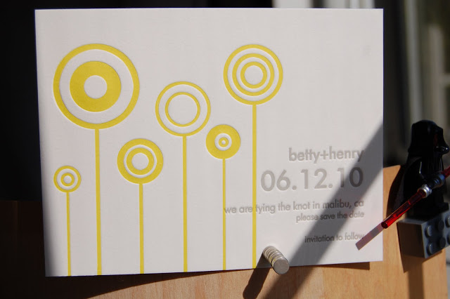
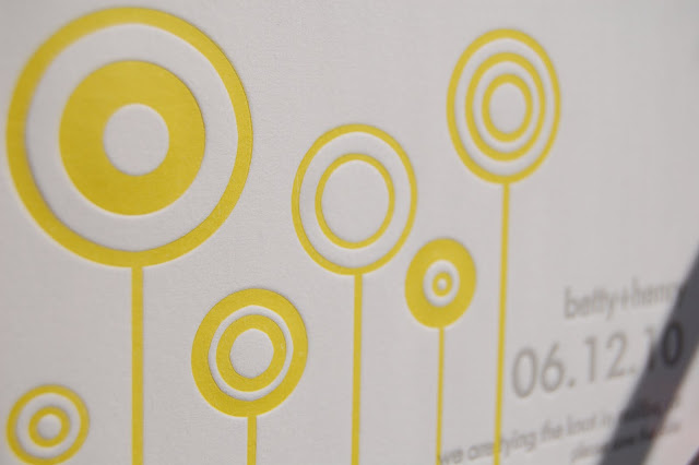
After all the wedding projects I have worked on, I am finally working on my own. I never really put any thoughts into what style I would have when I make my own wedding invitation, but I knew from day one that it would be YELLOW and letterpressed.

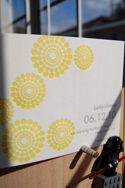
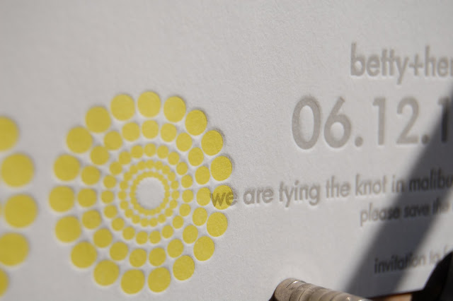
I wanted something simple, happy and a bit silly, something with ME written all over. So I picked up my pen and did a few designs with circles on my bamboo. My favorite was the one with orangic circles randomly overlapping each other. Henry, my fiance, picked the one that I arranged some polka dots into floating flowers in various sizes. My sister (and my matron of honor) picked the one I did by layering different size and thickness of circles into flowers with stems (she thought they were lollipops).

With so many different opinions swaying me, I absolutely couldnt decide which one to be the final one, so I decided to have them all (wouldnt life be so much easier if we could do that whenever we cant make up our minds?).


I loved the random organic circles, they looked adorable to me :) Or maybe simply because i hand drew each one of them


The polka dot flower design is simple and clean


This lollipop layout is very whimsical.

Which one is your favorite?
happy holidays

HenryComment
Life has been busy but wonderful since we had our little addition, kammie. She is loved and adored by friends and family, so I incorporated her into my 2009 xmas card. What could be a better way to incorporate her than put her chubby face in an ornament?


I made some paper ornaments and turned them into photo frames. They were fun xmas pattern paper layered with heavy cardstock, then punched out the center for pictures to peep through.


I even had different pictures of Kammie in each ornament.


A silver cap and a shiny hanging thread completed the ornament. Only the body of the ornament was glued to the card, the silver cap and the hanging thread were left hanging. I love how it casts shadow fromt the light.


You can clearly see the thickness of the ornament, it helps the ornament pop from the white backdrop.


To celebrate the holidays, even my sheepie dressed for the occasion :)

thank ewe

Henry1 Comment
a black sheep with fluffy white fur is exactly what a sheep lover is looking for when shopping for her baby shower thank you cards


tiny irregular cubes of felt were layered on to mimic real sheep fur texture, to further bring out the cuddliness of the sheep, its face and legs were left in black.


a simple boarder was added to draw attention to the focal point - the sheep

Jojo

Henry1 Comment
I enjoyed every minute of creating this thank you card for a yellow and green theme baby shower, the mother-to-be adores things simple yet elegant, so a card with a bib taking center stage couldnt be more perfect for her.


The card itself has a smooth finish, but the bib has a rough texture, which made white layered with white anything but borning


bib's trim was finished with sage green thread, hand sewned!


"thank you" written in brown ink for a softer look than black ink


name of my workshop letterpressed on the back of the cards


cards (a set of 20) with envelopes wrapped in yellow to continue the theme color and to add a little personal touch.

Camellia

Henry1 Comment
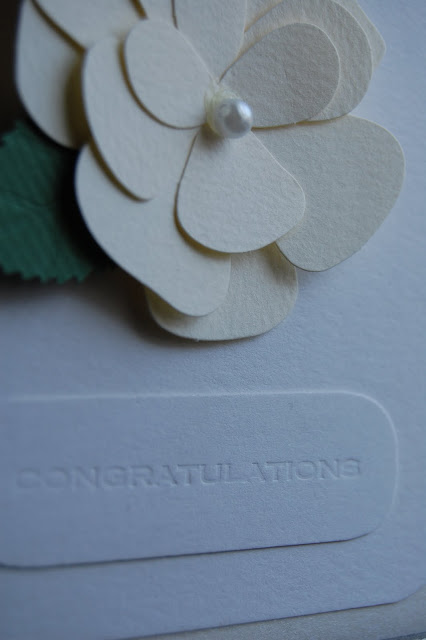
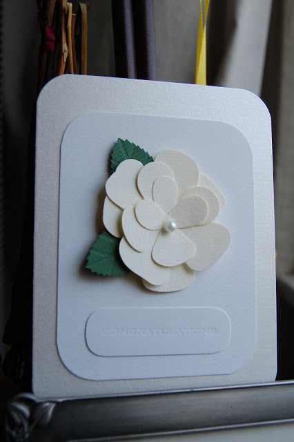
What could be a better card to a gentle bride for her simple elegant wedding than a card with Camellia? I love to mix monochromatic colors with a touch of accent color, it is simple but not boring.


The flower is in cream with a dash of green, sitting on top of a pure white cotton card to bring out the softness of the cream color. To elaborate the celebration spirit yet stay within the simple elegant theme, a warmer cream card with champagne shimmer was added.
The card was as soft and sweet as the soft-spoken bride.


Greeting was pressed blank on another small piece of card to create layer and subtle statement without being too loud.


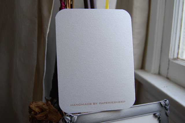
Finally, the card got a personal stamp from me.

Sweet as a cupcake

HenryComment
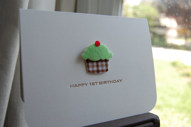
Over the weekend I had to create a birthday card to celebrate the first milestone birthday of a little girl named Chloe, she is such a sweet baby, always smiling, giggling and playful.

As I was trying to come up with a theme that would better describe her personality, I thought of a cupcake. Not only I love cupcakes personally, but I thought she is just as adorable, fun and little as a cupcake!


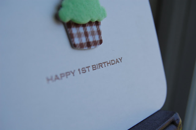
A little fuzzy cupcake was perfect to take center stage, it's as cuddly as the birthday girl. Bottom corners were rounded off to add a bit more fun flare.


The card itself measured 4 x 5.5, my personal favorite size for cards. It's not too small where you have limited space for creativity and not too big where it looks empty, or, often awkwardly spaced out. Plus, it's a perfect size to print on my Kelsey 5 x 8 press.

Joey

HenryComment
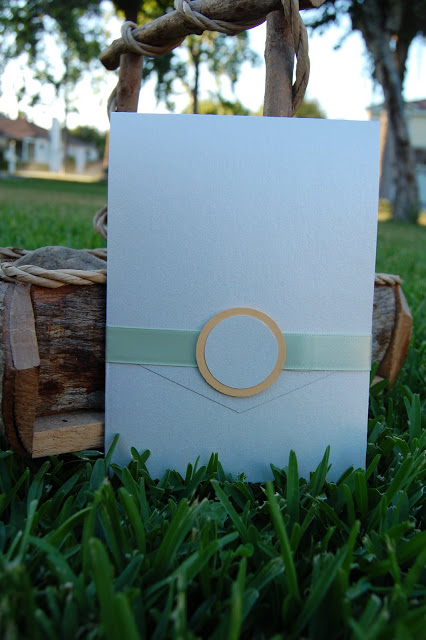
worked on a sample for a groom today, he asked for a layered insert style invitation, this is what i did for him.


the invitation opens vertically


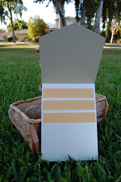
the first card, smallest one, will be map, then rsvp, and then with the largest one being the announcement.
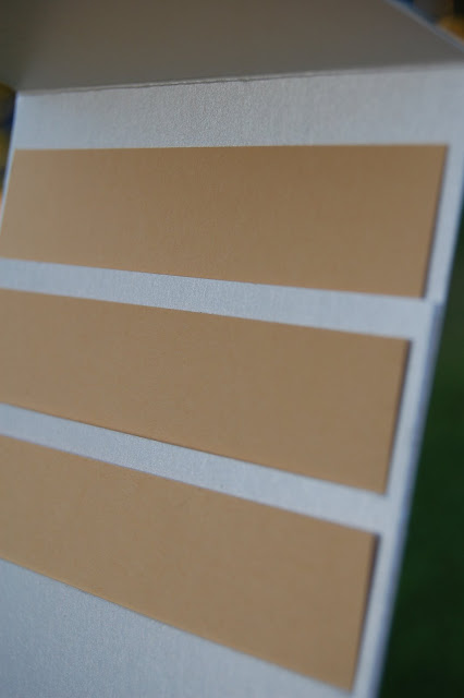

the largest card is inserted into a pocket, and two slits are made on the pocket to make room for two smaller cards. i kept some space in between each cards to emphasize the layered look.
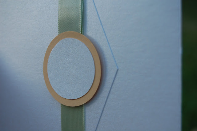

a simple tag is used, but can be replaced with any design request.
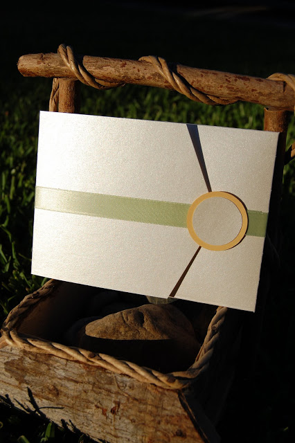

i think it's also nice if open horizontally

Baby Elephant

HenryComment

to announce the arrival of a baby boy, i did this simple 5" x 5" white card with an adorable grey elephant in felt. it doesnt have the usual "it's a boy" stamped on the cover of the card, but i liked how the grey elephant could also be good for a baby girl.


i think a skinny border around the elephant made the card look more elegant than kidish :)

Jules

HenryComment

A lime color theme wedding called for a lime color wedding card


loved the details on the wedding cake


a border was created to bring out the dimension of the cake

Yellow I Do

HenryComment
Worked on a simple wedding invitation for a bride, it was for her city hall wedding in NYC. Since the bride had only couple friends joining her and the groom, she opted for a fun coaster style wedding invitation.


The size of the card was 5" x 5", and the color was sunshine yellow with shimmer midnight blue, very happy and upbeat, just like the bride.


I liked the thickness of the paper and the felt texture of the paper. It picked up the font very nicely.

Save-the-Date: Jenny

HenryComment
this is a nice little save-the-date to stick to the fridge :) not only it has names of the couple, but also come with its own little calendar and the date clearly marked. the theme color of the wedding is acutally sage rather than pumpkin, pumpkin is picked to indicate season of the wedding, Fall, and to compliment the green :)


size of the card is 4.5 x 4.5, heavy pumkin cardstock layered with a smooth matt cream cardstock. to bring out the satin texture of the pumpkin cardstock, a satin ribbon in sage is added to complete the card.


the ribbon is functional too! it held the names of the bride and groom-to-be to the card :)

Rosey Fuschia

Henry3 Comments
This invitation was created for a fuschia/chocolate themed wedding in the Fall. i wanted the envelope to have some interesting texture, so i found this crushed leather look-alike paper, it gave it a modern and luxurious touch.


to incorporate a little bit of girliness into the invitation, i layered a band of silky textured paper then a little strip of rough moss-like material in pink. finally, to complete the look, i wrapped the silk band with couple rounds of a superfine deep pink coated wire.the announcement


inside is soft ashy pink, slighty textured. to bring in a little bit of brown, intricate roses were stamped on opposite corners.


I enjoyed stamping in this project very much, it made the announcement looked extra romantic :)

Celebrate

HenryComment
I wanted to make a card that is appropriate for many different occasions, so here is what i came up with


of course i had better representation of the card, but i love how the shadow casts over the card, kinda romantic, but here is a closer look of the card


the card is a 5 x 5 folding card, blank inside, perfect for any occasion!

for mom-to-be

HenryComment
with many family and friends becoming pregnant, i was inspired to make a greeting card to celebrate such a happy moment with them


it is a folding card letterpressed on a 6" x 8" somerset paper then folded into a 6" x 4" card. the cover reads "(expecting)". i like lower cases, it looks modern and young.


inside i had something simple for the mom-to-be.


i had lots of fun making this card, cuz it's not only making something i enjoy, but it was for a purpose that might bring a smile to my friends' faces.

Something NEW: Astro Boy

HenryComment
i wanted to do something new, something different and something cute, so i did a small printing block. i found a cute looking character and drew it on the little lino block with pencil then the rest is history


my handy tool and cute little astro boy waiting to be carved


occasionally applying heat to the block to soften the surface for easier carving


carefully carving the outline of astro boy. time consuming but fun


final product!


my very first experience of block carving was in high school, i almost forgot how fun it was! i am planning to carve something bigger and with higher level of difficulty :)